- Comparison criterion
- Data sources comparisons
- Comparison North America
- Updated data
- Variations
- Satel-light data
Comparison criterion
For the comparison of data from different sources, we have chosen as reference the annual available irradiation [kWh/m²/year]. This parameter is relevant for PV grid systems, as the PV output is quasi-linear with the solar energy input. For other systems like stand-alone, the monthly or daily distribution may also be of interest, but comparisons would require much more complex statistical methods. We don’t show temperature results, which are of lower importance in PV systems.
In the comparisons we mainly refer to the Meteonorm 6.1 data, which is the default data in the PVsyst6 database, and therefore likely to be used in any “first” simulation of a given system.
Comparison between several data sources
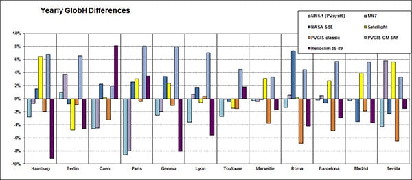
The next figure shows a comparison between seven meteorological data sources, for 12 locations in Europe. The graph shows the deviation from the average at each location in percent. The average has been performed over all seven sources without any weighting.
The following conclusions can be drawn from the graph:
- All sources agree among each other within 10% of the average.
- We cannot say which source is the more representative of the reality (and which reality? – no one is able to reliably predict the future climate).
- Meteonorm 6.1 gives mostly values which are lower than the average. This means that simulations with default values in PVsyst will be rather conservative, and give prudent results for the final yield of the customer’s systems.
- The more recent satellite-based values of PVGIS (CM SAF) are systematically larger than the average.
- The older PVGIS (classical) values are systematically smaller than the average.
- Satel-light data is also systematically larger than average, although on a smaller level than PVGIS CM SAF.

Comparison for North America
The next figure shows a comparison between five meteorological data sources, for 20 locations in the USA. Only locations where a data set with the Tvpical Meteorological Year (TMY) was available were chosen. Again the graph shows the deviation from the average at each location in percent and the average has been performed over all five sources without any weighting.
The conclusions are similar to the ones from the European comparison with the following additions:
- The differences between the sources seem to be a little less pronounced than for the European comparison, which may be partially due to the fact that only TMY locations were chosen.
- Meteonorm 7 and TMY values are very close for most of the sites.
- Meteonorm 6.1 now gives mostly values which are slightly higher than the average, leading to more optimistic simulation results for US sites.
- NASA-SSE values are systematically smaller than the average.
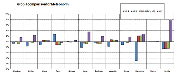
Changes within the data of the same provider
The providers of meteorological data keep updating and improving their databases and algorithms. As an example, the following graph shows values for the twelve sites of the European comparison for different Meteonorm Versions.
Almost all values stay the same within a few percent, but for Barcelona and Sevilla one sees that significant corrections were performed between V4 and V6, and V6.1 and V7 respectively.
Changes like this can also be observed for other providers like NASA or PVGIS, although for different sites. In the previous plot, the difference between the PVGIS ‘classical’ values and PVGIS CM SAF is particularly striking. Although these values are based on two different measurement techniques (terrestrial measurements and satellite images), the provider PVGIS attributes part of this difference to a climatic change that took place between the end of the 20th and beginning of the 21st century. For the detailed explanation check this PVGIS page.
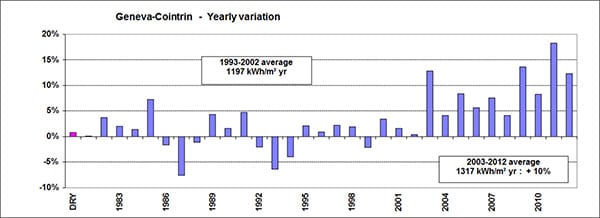
Yearly variations and climatic evolution
The following graph is based on an homogeneous sample of continuous measurements from the same source (ISM – Swiss Institute for Meteorology) for Geneva, from 1981 to 2012.
It shows that in Geneva, the annual variation of the global horizontal irradiance stayed well below 5% with only a few exceptions during 20 years. But the year 2003 was quite exceptional, and then the average increased significantly up to now, staying 10% above the previous value. This is not necessarily valid for other sites in Europe!
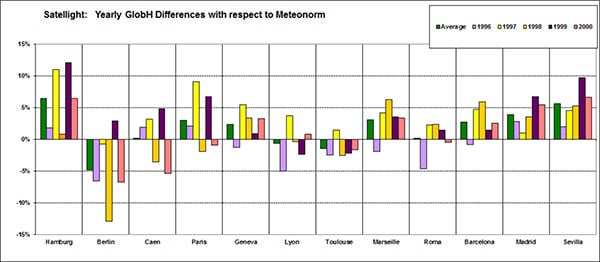
Satel-light data
For other sites in Europe, the Satel-light data is always far over the Meteonorm data, with one exception in Berlin. This exception is not attributable to the Meteonorm value; as we can see on the global comparison plot above, the Satel-light data for Berlin is significantly below the other Satellight data. We don’t have any explanation for that.
